


Informer API
Informer is an embeddable forms SDK that provides beautiful drawer-based forms for any website. Add data collection to your site with a single script tag. Inform on your users so you don't have to ask.
What You Can Build
- Contact forms - Slide-in drawers for user inquiries
- Application forms - Multi-field forms with validation
- Newsletter signups - Email capture with interest tracking
- Nomination forms - Let users inform on others
- Custom forms - Any data collection need
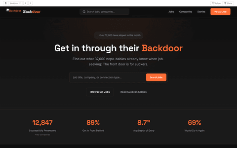
Live Demo
See what you can build with the Informer API.
Quickstart
Add forms to your site in under 60 seconds.
1. Add a trigger button
<!-- Add data attributes to any button -->
<button data-informer="contact"
        data-informer-source="your-site"
        data-informer-type="contact">
  Contact Us
</button>
2. Include the SDK
<!-- Add before </body> - auto-initializes -->
<script src="https://informer.vagibond.com/informer-core.js" async></script>
That's it! Click the button and a form drawer will slide in from the right. Submissions are sent to /api/form.
Installation
Informer can be loaded via CDN or self-hosted.
CDN (Recommended)
<script src="https://informer.vagibond.com/informer-core.js" async></script>
Self-hosted
# Download and host locally
curl -O https://informer.vagibond.com/informer-core.js
Auto-Initialization
The SDK automatically binds click handlers to any element with the data-informer attribute.
<button data-informer="backdoor-apply"
        data-informer-title="Slip Into This Position"
        data-informer-subtitle="Skip the line. Get in through the back."
        data-informer-source="backdoor"
        data-informer-type="application"
        data-informer-accent="#ff6b35">
  Apply via Backdoor
</button>
Data Attributes
| Attribute | Description |
|---|---|
data-informer |
Form ID (predefined or custom). Required. |
data-informer-title |
Override the form title |
data-informer-subtitle |
Override the form subtitle |
data-informer-source |
Source identifier sent with submission |
data-informer-type |
Type identifier sent with submission |
data-informer-accent |
Override the accent color (hex) |
data-informer-bg |
Override the background color (hex) |
Programmatic API
For full control, use the JavaScript API directly.
Informer.open(config)
Open a form drawer programmatically.
Informer.open({
  formId: 'contact',         // Predefined form ID
  title: 'Get In Touch',
  subtitle: 'We\'ll inform ourselves of your message.',
  source: 'your-site',        // Identifies the source
  type: 'contact',            // Form type
  submitLabel: 'Send',
  successMessage: 'Thanks! We\'ll be in touch.',

  // Optional callbacks
  onOpen: () => console.log('Form opened'),
  onSubmit: (data, response) => console.log('Submitted', data),
  onClose: (reason) => console.log('Closed via:', reason),
  onError: (errors) => console.log('Validation errors', errors),
});
Custom Fields
Define your own form fields.
Informer.open({
  title: 'Custom Survey',
  source: 'myapp',
  type: 'survey',
  fields: [
    { name: 'name', type: 'text', label: 'Full Name', required: true },
    { name: 'email', type: 'email', label: 'Email', required: true },
    {
      name: 'rating',
      type: 'select',
      label: 'How did we do?',
      options: [
        { value: '', label: 'Select...' },
        { value: 'excellent', label: 'Excellent' },
        { value: 'good', label: 'Good' },
        { value: 'poor', label: 'Poor' },
      ]
    },
    { name: 'feedback', type: 'textarea', label: 'Comments', rows: 4 },
  ],
  submitLabel: 'Submit Feedback',
});
Informer.close(reason)
Close the drawer programmatically.
Informer.close('custom'); // reason is passed to onClose callback
Informer.configure(options)
Set global configuration options.
Informer.configure({
  theme: {
    accentColor: '#ff6b35',
    backgroundColor: '#1a1a1a',
    borderRadius: '12px',
  }
});
Events & Callbacks
Hook into the form lifecycle with callbacks.
Informer.open({
  formId: 'contact',
  source: 'mysite',
  type: 'contact',

  // Called when form opens
  onOpen: () => {
    analytics.track('form_opened');
  },

  // Called on successful submission
  onSubmit: (data, response) => {
    console.log('Submitted:', data);
    analytics.track('form_submitted');
  },

  // Called when form closes (any reason)
  onClose: (reason) => {
    // reason: 'submit' | 'escape' | 'overlay' | 'button'
    console.log('Closed via:', reason);
  },

  // Called on validation error
  onError: (errors) => {
    console.log('Validation errors:', errors);
  }
});
Predefined Forms
Informer includes several pre-built forms that you can use out of the box.
| Form ID | Description | Fields |
|---|---|---|
backdoor-apply |
Job application form | name, email, phone, method, bribery_amount, flexibility, message |
contact |
Basic contact form | name, email, message |
newsletter |
Email signup | email, interests[] |
nomination |
Award nomination | nominee_name, category, reason, nominator_email |
Using a Predefined Form
<!-- Just reference the form ID -->
<button data-informer="backdoor-apply"
        data-informer-source="backdoor"
        data-informer-type="application">
  Apply via Backdoor
</button>
Field Types
Informer supports a variety of field types for building custom forms.
| Type | Description | Properties |
|---|---|---|
text |
Single-line text input | name, label, placeholder, required |
email |
Email with validation | name, label, placeholder, required |
tel |
Phone number | name, label, placeholder, required |
number |
Numeric input | name, label, min, max, required |
textarea |
Multi-line text | name, label, placeholder, rows, required |
select |
Dropdown select | name, label, options[], required |
radio |
Radio button group | name, label, options[], required |
checkbox |
Checkbox group (multi-select) | name, label, options[] |
range |
Slider | name, label, min, max, step, defaultValue, format() |
date |
Date picker | name, label, required |
hidden |
Hidden field | name, value |
Field Options Example
fields: [
  // Text input
  { name: 'name', type: 'text', label: 'Name', required: true, placeholder: 'John Doe' },

  // Select dropdown
  {
    name: 'method',
    type: 'select',
    label: 'Preferred Method',
    required: true,
    options: [
      { value: '', label: 'Select...' },
      { value: 'email', label: 'Email' },
      { value: 'phone', label: 'Phone' },
    ]
  },

  // Range slider with custom format
  {
    name: 'budget',
    type: 'range',
    label: 'Budget',
    min: 0,
    max: 10000,
    step: 100,
    defaultValue: 1000,
    format: (v) => `$${v.toLocaleString()}`
  },

  // Checkbox group
  {
    name: 'interests',
    type: 'checkbox',
    label: 'Interests',
    options: [
      { value: 'product', label: 'Product Updates' },
      { value: 'news', label: 'Company News' },
    ]
  },
]
Theme Configuration
Customize the form appearance to match your brand.
Informer.configure({
  theme: {
    // Colors
    background: '#0f172a',         // Drawer background
    headerBackground: '#1e3a5f',  // Header background
    text: '#ffffff',              // Primary text
    textMuted: 'rgba(255,255,255,0.6)',  // Secondary text
    border: 'rgba(255,255,255,0.1)',
    inputBackground: '#1e293b',
    inputBorder: 'rgba(255,255,255,0.2)',

    // Button colors
    buttonBackground: '#22c55e',
    buttonText: '#000000',
    buttonHover: '#16a34a',

    // Accent (focus states, success icons)
    accent: '#22c55e',
    errorColor: '#ef4444',
    successColor: '#22c55e',

    // Styling
    borderRadius: '8px',
  }
});
Example: Orange Backdoor Theme
Informer.configure({
  theme: {
    background: '#1a1a1a',
    headerBackground: '#2a2a2a',
    buttonBackground: '#ff6b35',
    buttonHover: '#e55a2b',
    accent: '#ff6b35',
  }
});
Form Submission
Form submissions are POST requests to /api/form with the following payload:
{
  "form_source": "backdoor",
  "form_type": "application",
  "name": "John Doe",
  "email": "john@example.com",
  "method": "bribery",
  "bribery_amount": "5000",
  // ... other form fields
}
Changelog
- Core SDK with auto-initialization
- Drawer-based form UI
- Predefined forms (backdoor-apply, contact, newsletter, nomination)
- Custom field types (text, email, select, checkbox, range, etc.)
- Theme customization
- Event callbacks (onOpen, onSubmit, onClose, onError)
- Form validation
- Mobile-responsive design
- Success state with auto-close